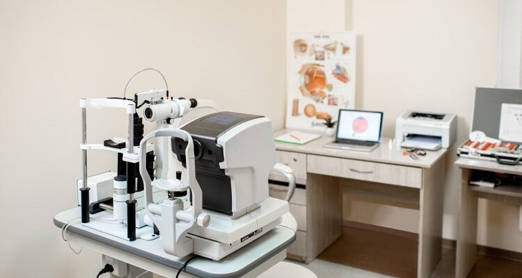
When designing an optometry office, you want to make sure that it is functional and attractive. There are a few dos and don’ts that you should keep in mind when creating your space. This article discusses the dos and don’ts of designing an optometry office. So, whether you are just starting to plan your office or are already in the process of designing it, make sure to keep these tips in mind.
Table of Contents
Do Think about the Type of Space Desired
When designing your optometry office, the first thing you should do is think about what type of space will work best for you. Some people prefer small rooms with limited windows, while others need larger spaces that have plenty of natural light. You may also want to consider the size and shape of your practice, as well as any other factors like location or parking availability, before making this decision. Once you’ve decided on an appropriate layout, it’s time to start thinking about furniture placement and lighting options.
After deciding which room layout would work best in your situation, there are some things that must be considered. Is there enough natural light? Are all walls covered by blinds or shades? What kind of flooring is in the room? Is it easy to clean and durable? What furniture will you need in the room, and where should it go?
Don’t Overlook the Patient Experience
One of the biggest mistakes people make when designing an optometry office is not thinking about the patient’s experience. You want to create a welcoming and relaxing space but still professional. So, avoid using too many bright colors or busy patterns in your design.
Do Ensure There is Plenty of Lighting
One of the most important aspects of an optometry office is lighting. You want to make sure that there is plenty of light for your patients to see clearly, but you also don’t want the space to feel too bright or overwhelming. It’s a good idea to use different types of lighting fixtures throughout your office so that you can create different moods as needed. For example, you may want to use floor lamps for task lighting and overhead lights for general illumination.
Don’t Forget about Patients’ Stress and Nerves
It’s also important to remember that many people are uncomfortable going to see a doctor, so you should try to create a soothing environment for them. Another common mistake is choosing furniture that is not comfortable or stylish. Patients will spend a lot of time in your office, so it’s essential to make them feel at ease.
Do Choose Furniture Wisely
When choosing furniture for your office, you’ll want to make sure that it is both comfortable and stylish. You may also want to consider ergonomic options to make sure that your staff is able to work comfortably all day long. And don’t forget about the patients. They will appreciate having a comfortable place to sit while they wait for their appointment.
Don’t Ignore an Office’s Traffic Flow
There are certain rules of thumb to follow when designing reception desks, front desks, or office reception areas in your optometry practice. One of them is avoiding a reception desk that is on the right or left side. This creates a traffic jam as patients, staff, and doctors intersect. Many offices recommend that the table be placed at the center of the reception room.


Comments